Accessible interface for searching library databases
University of Guadalajara
Background
The University of Guadalajara had an outdated platform to manage the libraries’ database of books. System administrators did not want to touch any legacy code.
Scope
As an external contractor I was in charge of the redesign and development of a new interface, with the following objectives:
- Redesign the interface to follow the new design guidelines of the University of Guadalajara
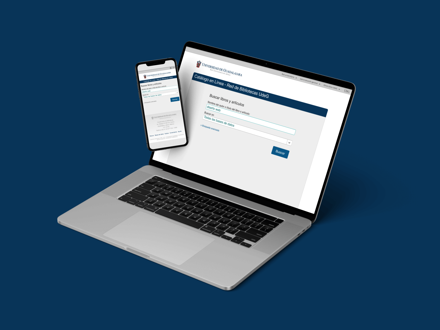
- The interface should be responsive, adaptable to desktop, tablet and phone devices
- The interface should be accessible, following Level AA Conformance of the Web Content Accessibility Guidelines (WCAG)
Project Management
Requirements Gathering
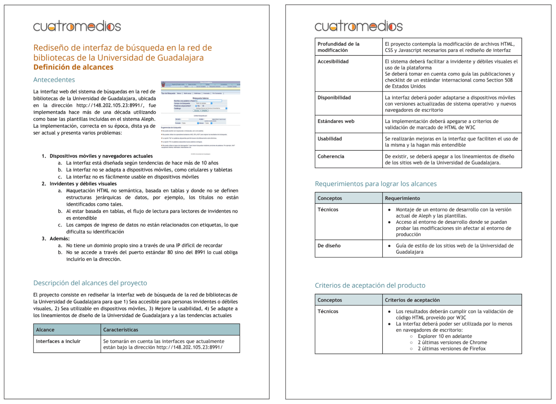
After the project was signed, I continued with requirements gathering. As the result, I created an Scope of Work documento to be used as validation of the scope with the client to continue with the process.
Design Process
Content Inventory
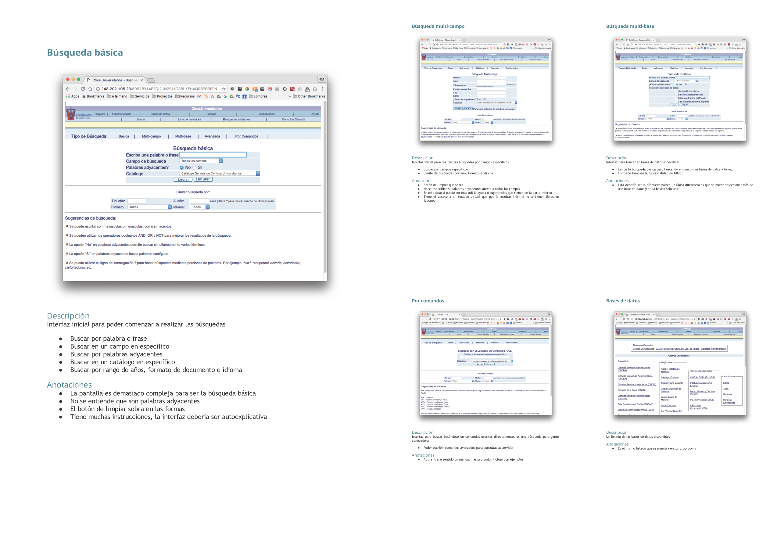
I was the only designer on the project. I started creating a content inventory with all current 20 screens, their descriptions and an initial analysis of areas of improvement about both design and code.
Research
I had 3 interviews with a visual impaired user. I learned how they used computer and web interfaces, mainly with the Jaws software. I validated the importance of following W3C standards when developing web interfaces and learned about Web Content Accessibility Guidelines.
Wireframes
I used wireframes to create the initial design deliverables. In the wireframing phase, I decided the content and their hierarchy, leaving out a lot of non important elements of the old interface.
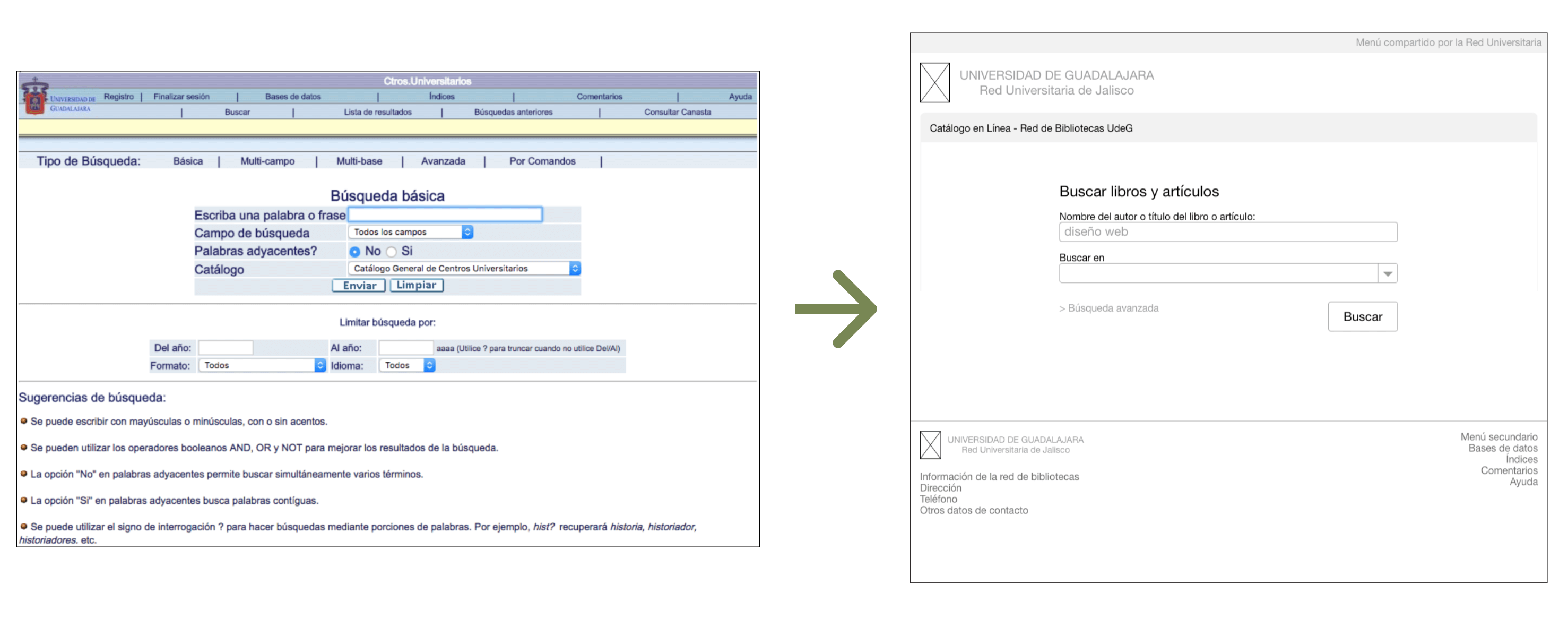
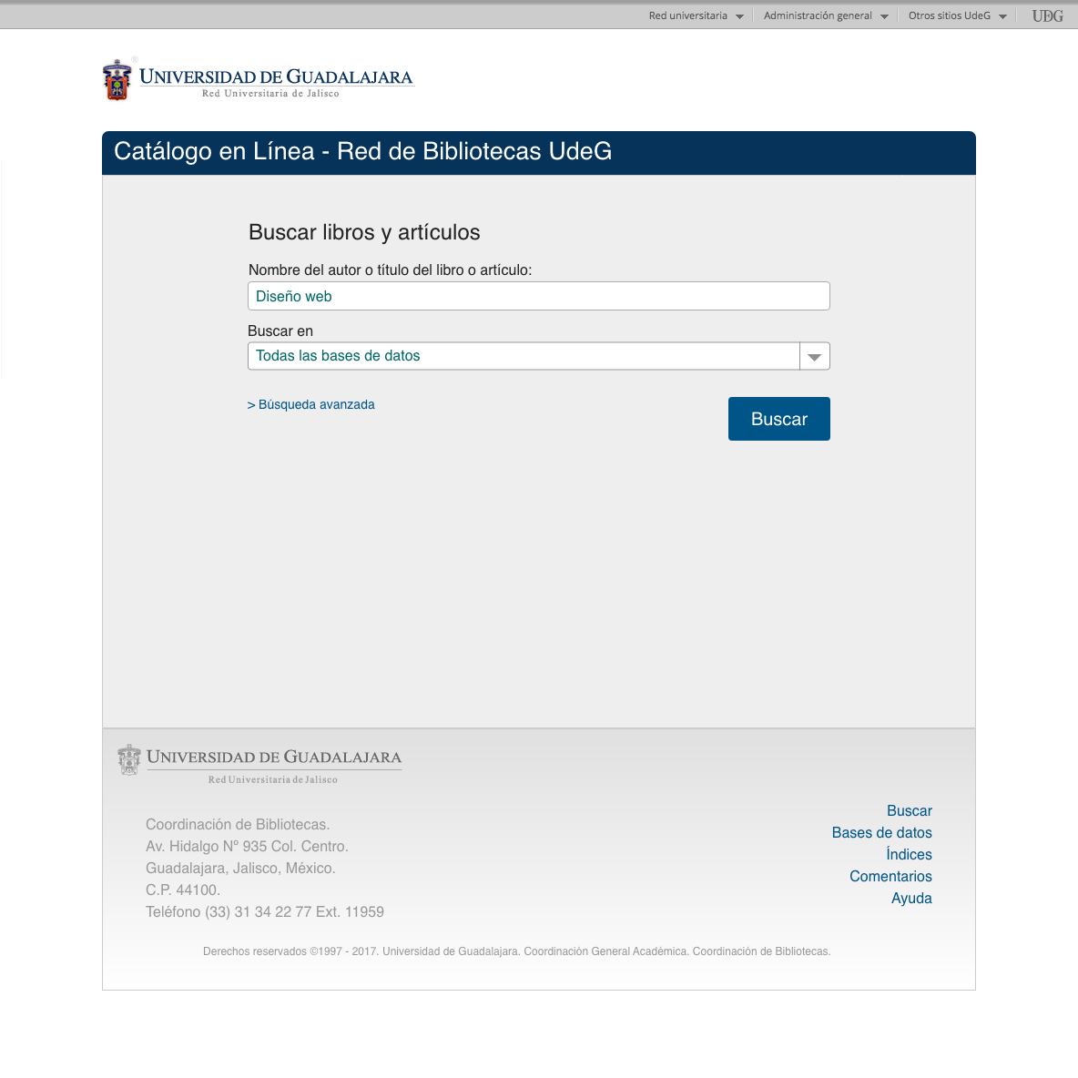
Search Screen
I removed most of the elements in the initial search screen to simplify the interaction. The old screen had some advanced function that were not frequently used, for example, if the search terms should be used only as adjacent words. I opted for a most common design pattern for search boxes, having just the search term field and the search button. Then I opted to add only one more field, the library where the search should be made, with default to All Libraries. I left a link to advanced search for power users
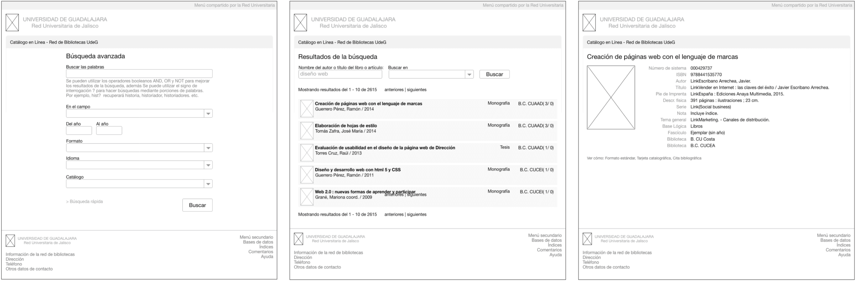
Advanced Search, Search Result and Book Detail
All the screens experienced a considerable reduction of elements to make them less cluttered. The wireframing phase was an excellent opportunity to propose the changes in that initial moment.
UI Design
I followed the University Of Guadalajara Web Design Guidelines to make the initial design decisions, but I had to discard some of the guidelines in favor of a more accessible interface.
Font Family
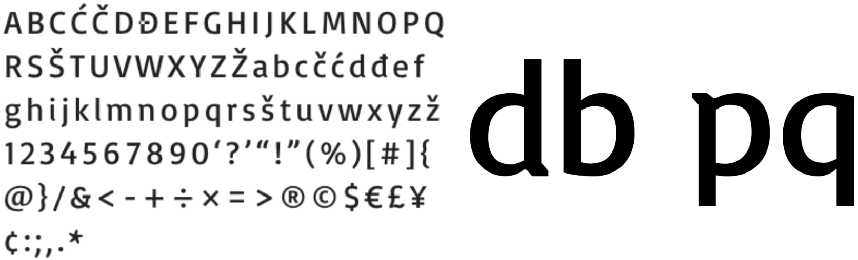
The design guidelines stated that the official font for websites was Open Sans, but according to accesible guidelines, it is recommended to use a font were pair of letters that may seen as mirrored, like d and b and p and q, should have a noticeable difference and not to be an exact mirror. That is why I opted to change the font to Basic font family. Other design decision related to fonts was increase the letter spacing, in order to reduce the possible confusion between the letter m, an the r and n letters together.
Composition
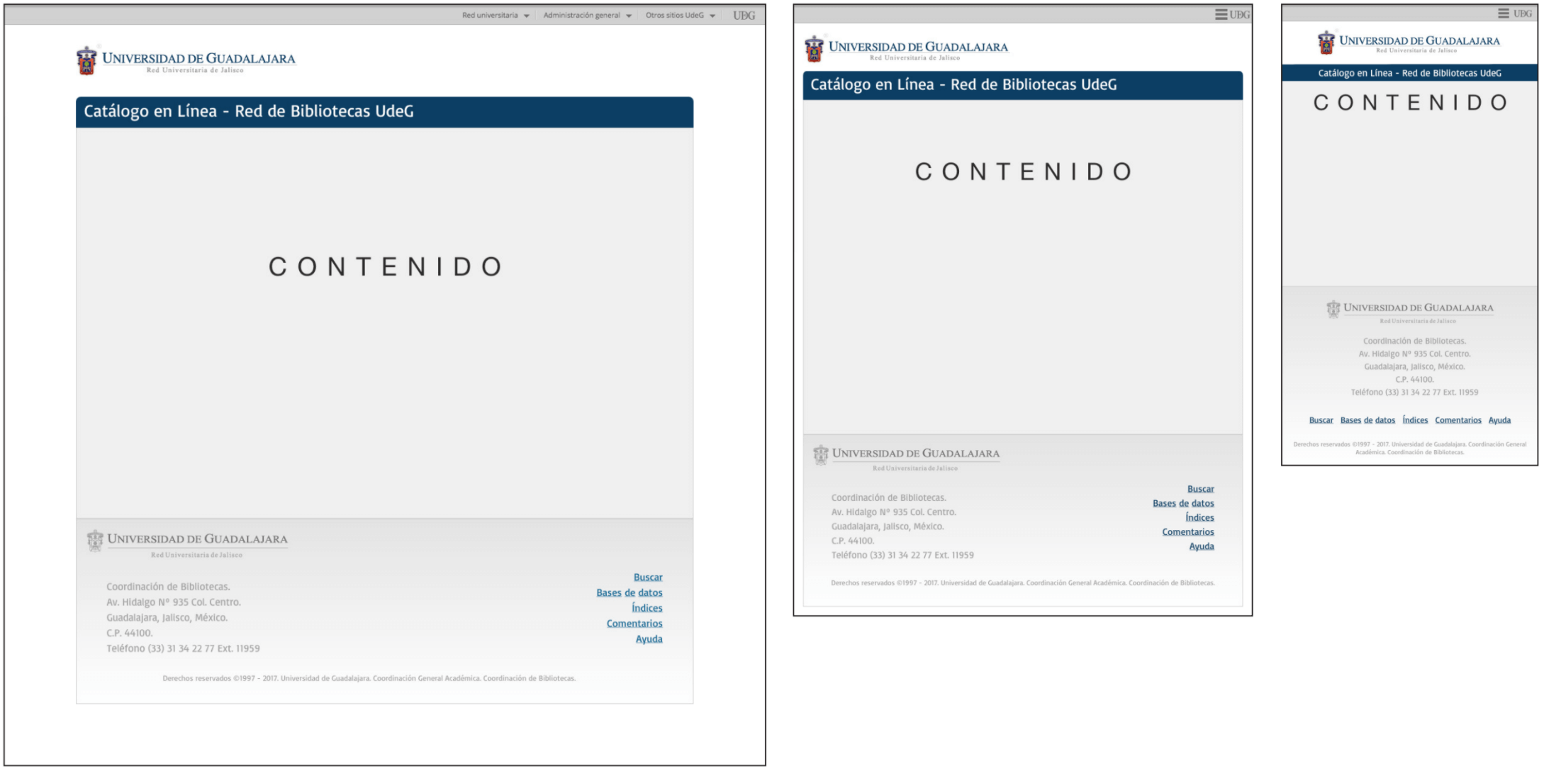
I designed the composition for all required screens, delivering desktop, tablet and phone variants.
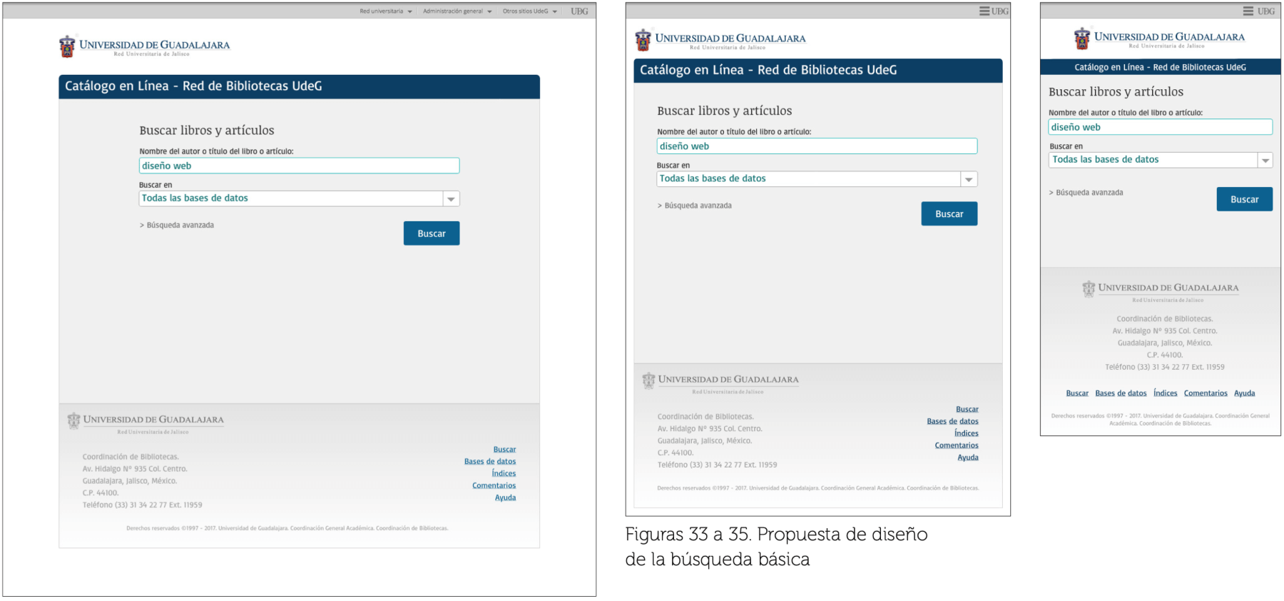
Basic Search
The basic search has a very noticeable call to action element: the "search" button. As explained before, the number of elements of this screen was reduced to a minimum, having only search box, where to search and the search button. Advanced search is option as as a clickable link.
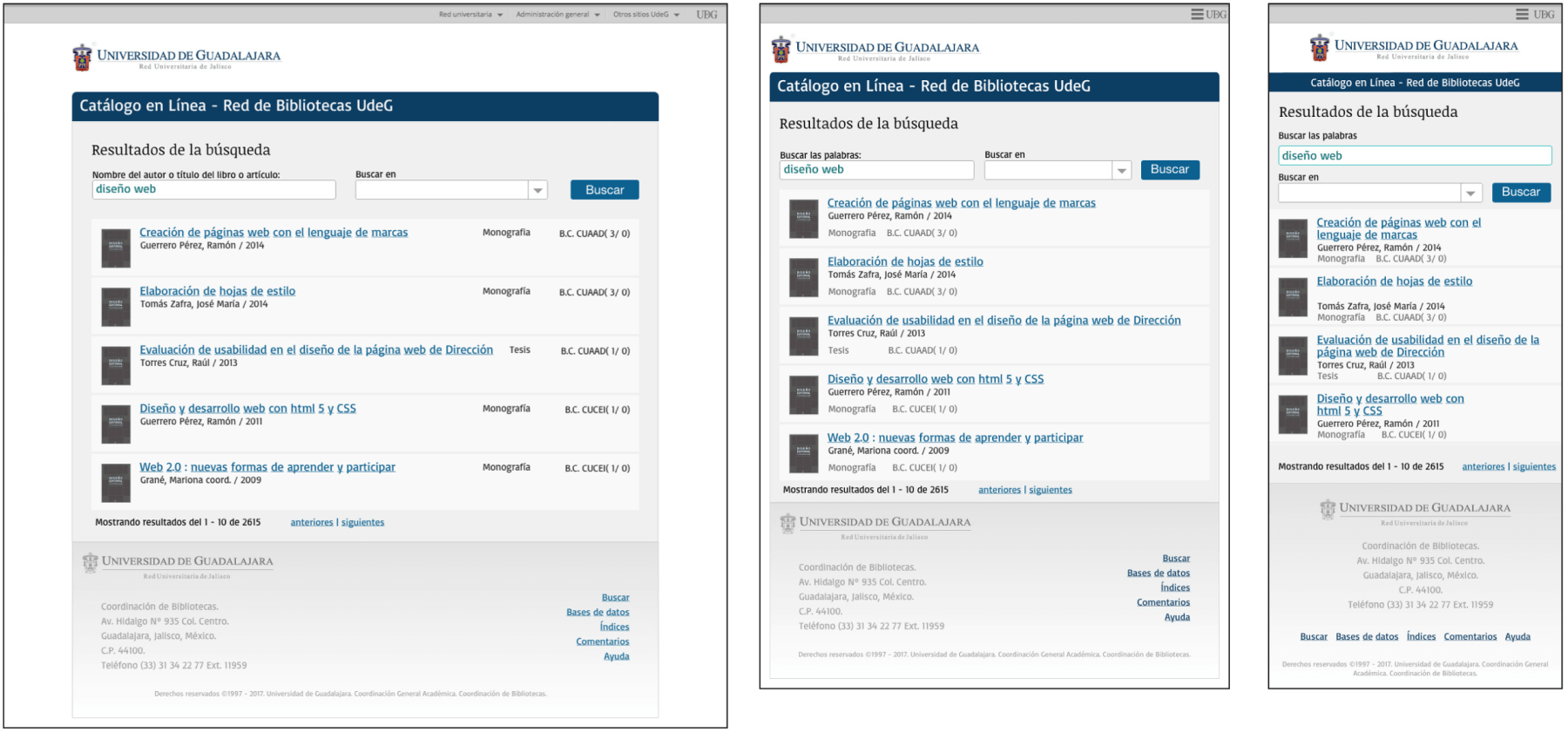
Search Result
The search result has a noticeable visual rhythm formed by each result item, were the clickable title stands out from the rest of the item elements. The search term is maintained in the search box at the top of the list, leting the user to refine their search without the need to re type everything again.
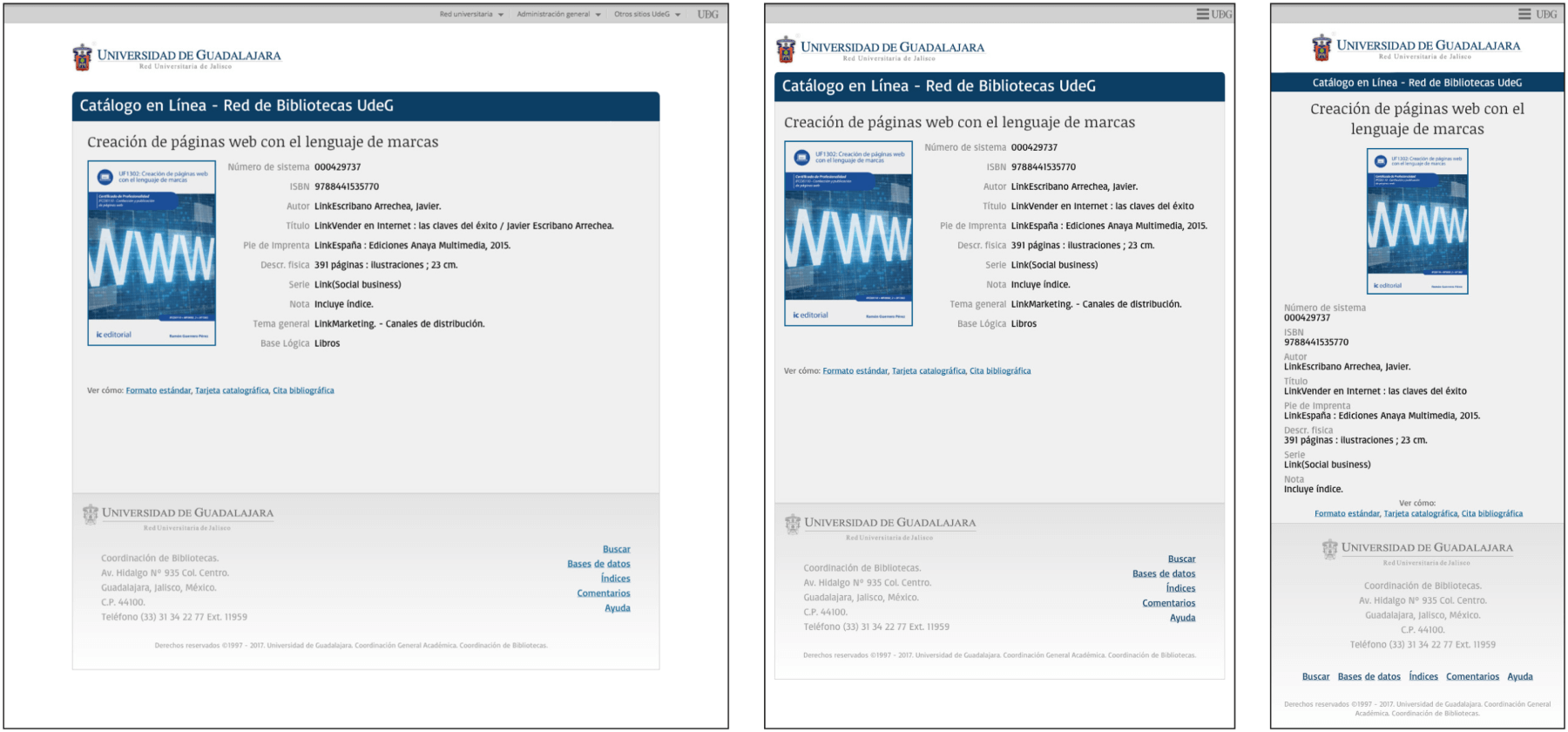
Book detail
The book detal, in desktop and tablet mode, has a two column layout for the textual information, pursuing a visual order all field values starts a the same point, the field names are dimmed, lowering their visual hierarchy. In phone view, the layout changes to one column.