Fragrances Marketplace App
Startup
The Project
Knowing about the existence of groups of people with a very high interest in buying and selling fragrances that are connected in social networks, a startup wanted to validate the idea of a dedicated digital platform that allow buyers and sellers to make transactions without the limitations or disadvantages of doing so in a social network group. (Work in progress)
Design
Currently, I am the only designer in the project.
Interviews
I interviewed both fragrances buyers and sellers, using video conference software due to the pandemic, to learn more about users. Some insights included why those users prefer to buy in social networks instead of going to a retail store and the most used applications in their phones With permission from the users, the interviews were recorded and transcribed.
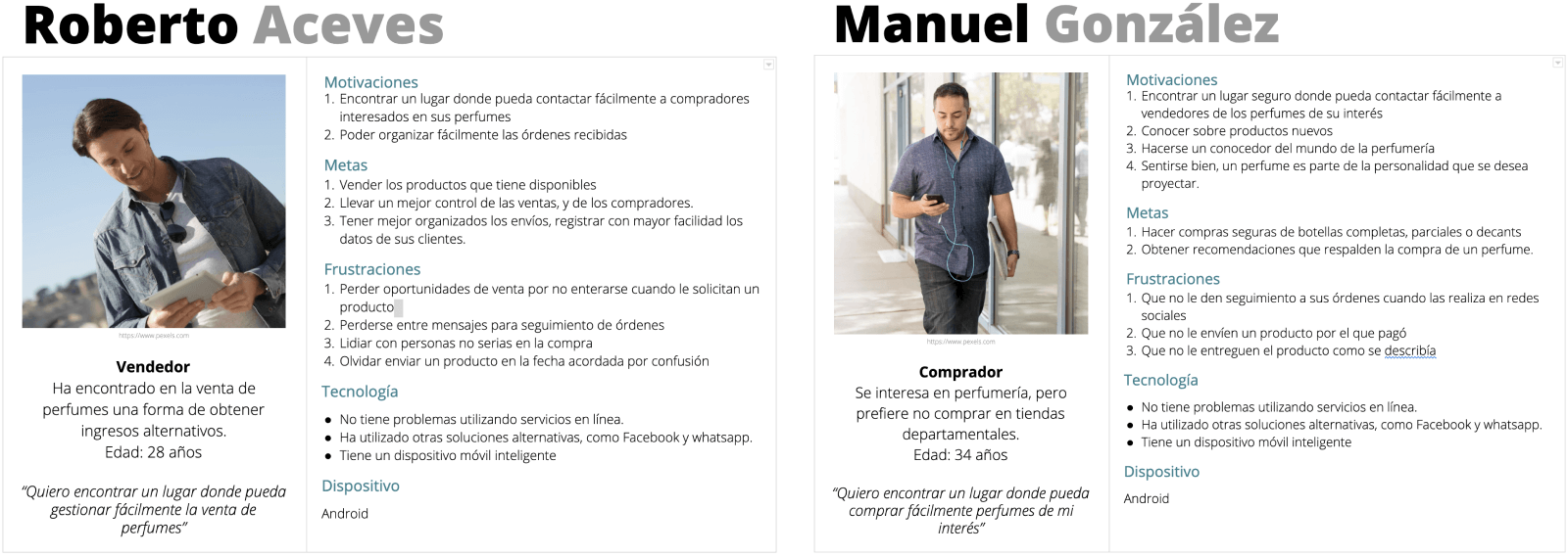
Proto personas
With the initial interviews, the most important information was documented in two Proto Personas.
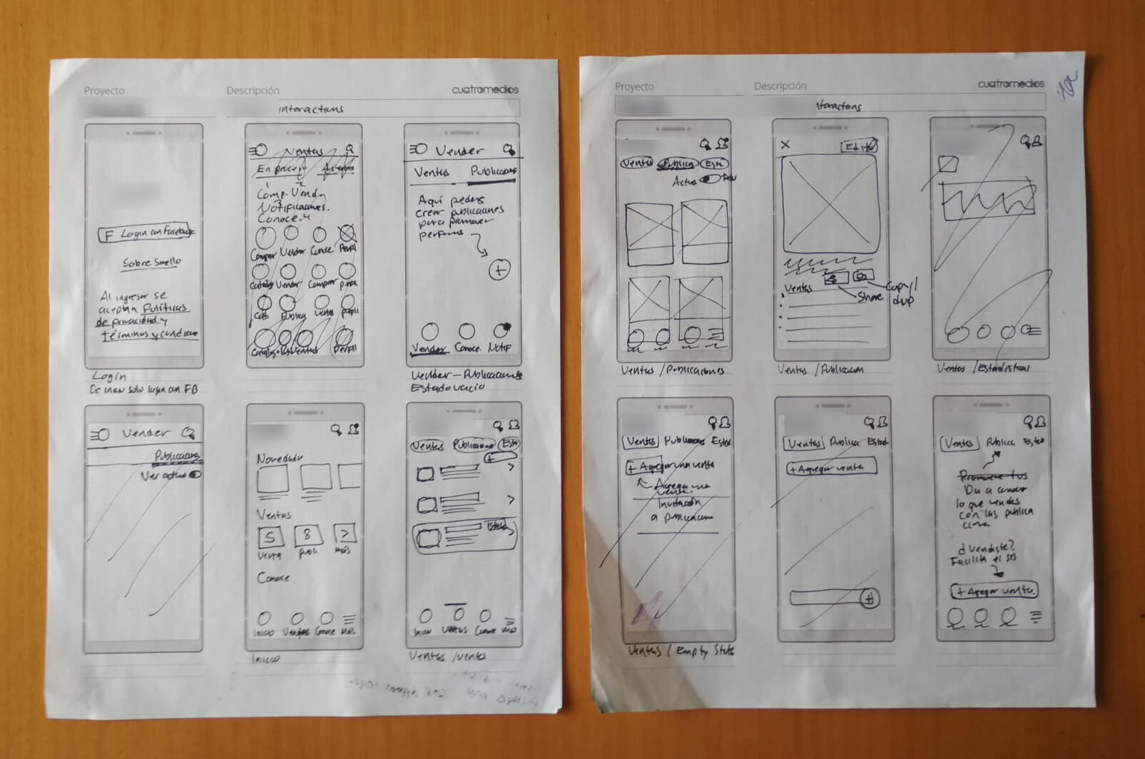
Sketches
I used sketches to quicly iterate in the interaction design process, the first objetive was to design the seller's flow.
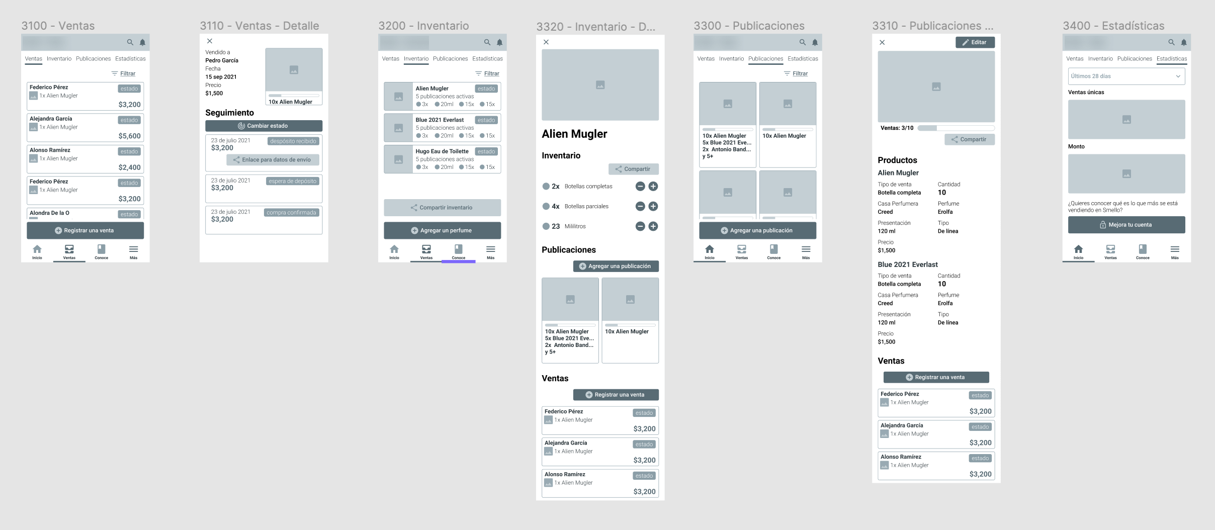
Wireframes
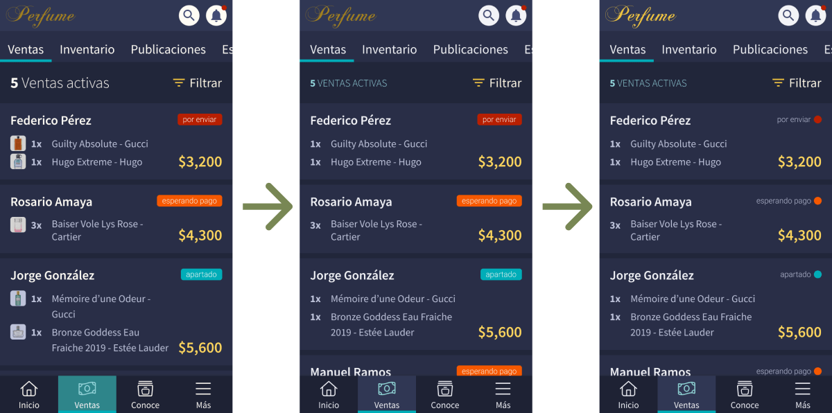
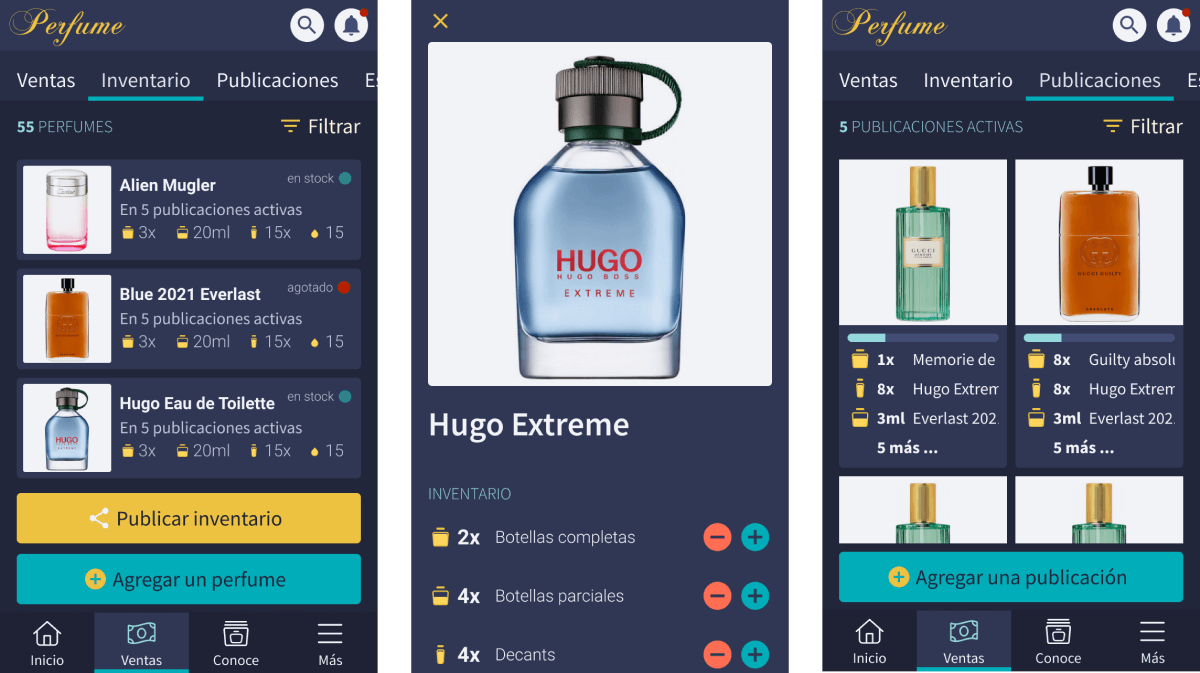
I created wireframes as a communication and validation tool with the client and a potential user. In the wireframes, I defined the flow for fragrance seller managing their sales and publications. Validating with the wireframes I noticed the necessity of separation of the inventory and publications features.
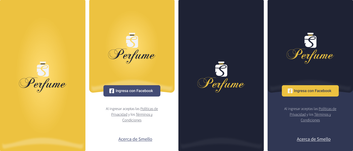
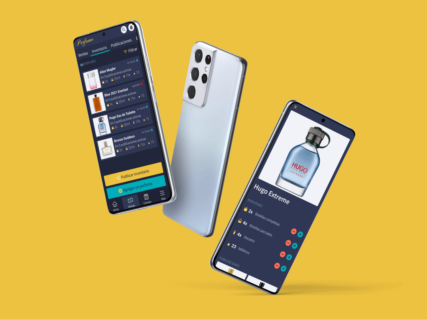
Visual design